Projects - - - - - - - - - -
eMoney UI ReDesign
Nightshift
Nightshift
Refreshing the look and feel of eMoney to take the established success of the product and bring the UI up to date while holding on to that level of trust the users have. With the product taking a new direction in revamping many features in the product and plans to release new features I lead a group of designers and stakeholders in coming up with a design language that would drive the new look and feel of the product.
Asked to lead the effort to come up with a new product UI look and feel.
How do we update the platform to look more contemporary and retain the success and loyalty built over the last 20 years. What visual treatment best represents the company, product and future direction we want to take?
Though discovery exercises with key stakeholders to align on what we are and where we want to be by using activities to align images that best represent what we think eMoney is today and where we want to be in the future.
Step 1: What we are, What we are not, What we aspire to be using cars.
Step 2: Gather visual examples of what that means to you and vote on them.
Step 3: Definition of what those visual stories tell.
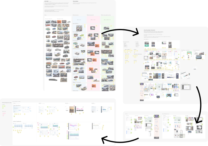
Through these various exercises we came up with four paths that define what we feel matches the brand and product direction. Coming up with four distinct styles that came from the groups diverge and converge activites we algined on how to present the four in a unified way for research.
Simple Premium
Functional Utility
Clean And Clear

Visually Stunning
Taking these four styles we presented them to our users to gather research on which one was more accepted as the right path.
By conducting preference testing we were able to get user insight on what they prefer to look at 8 hours a day.
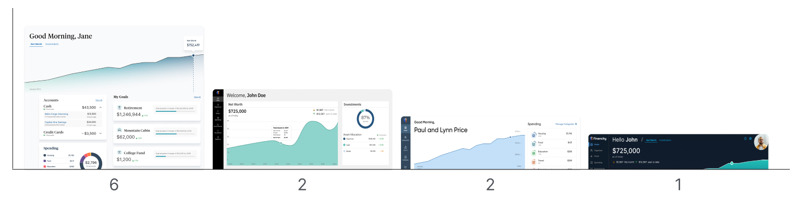
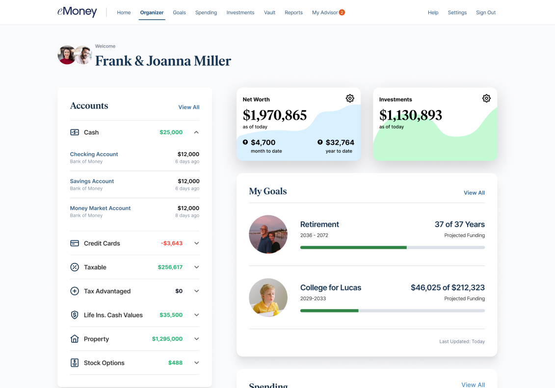
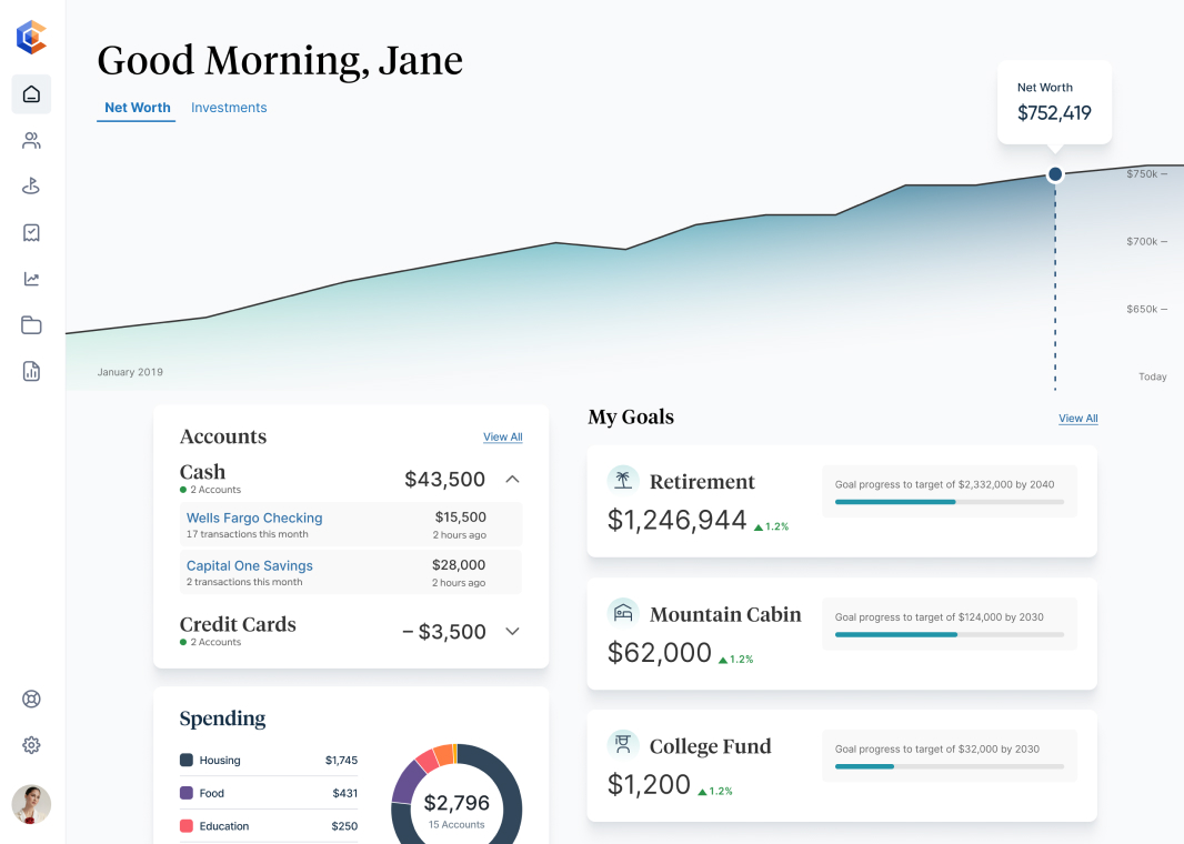
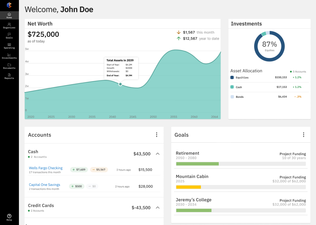
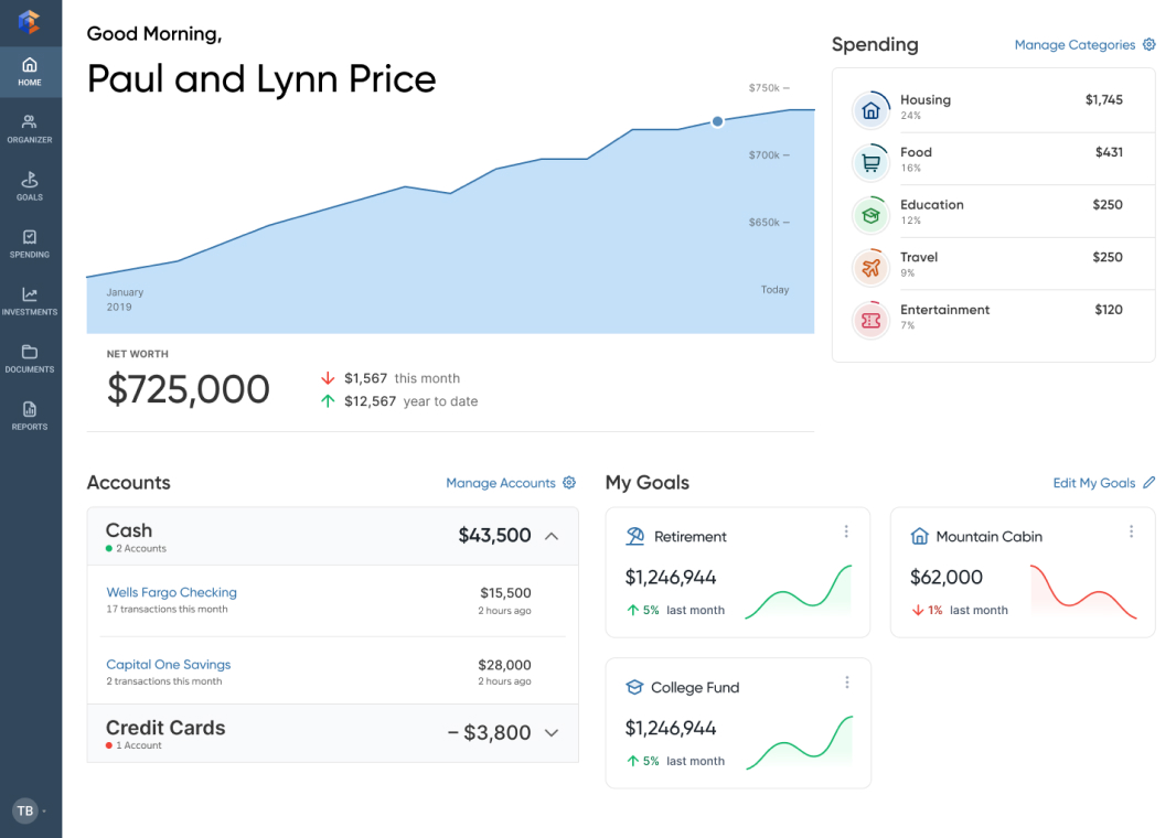
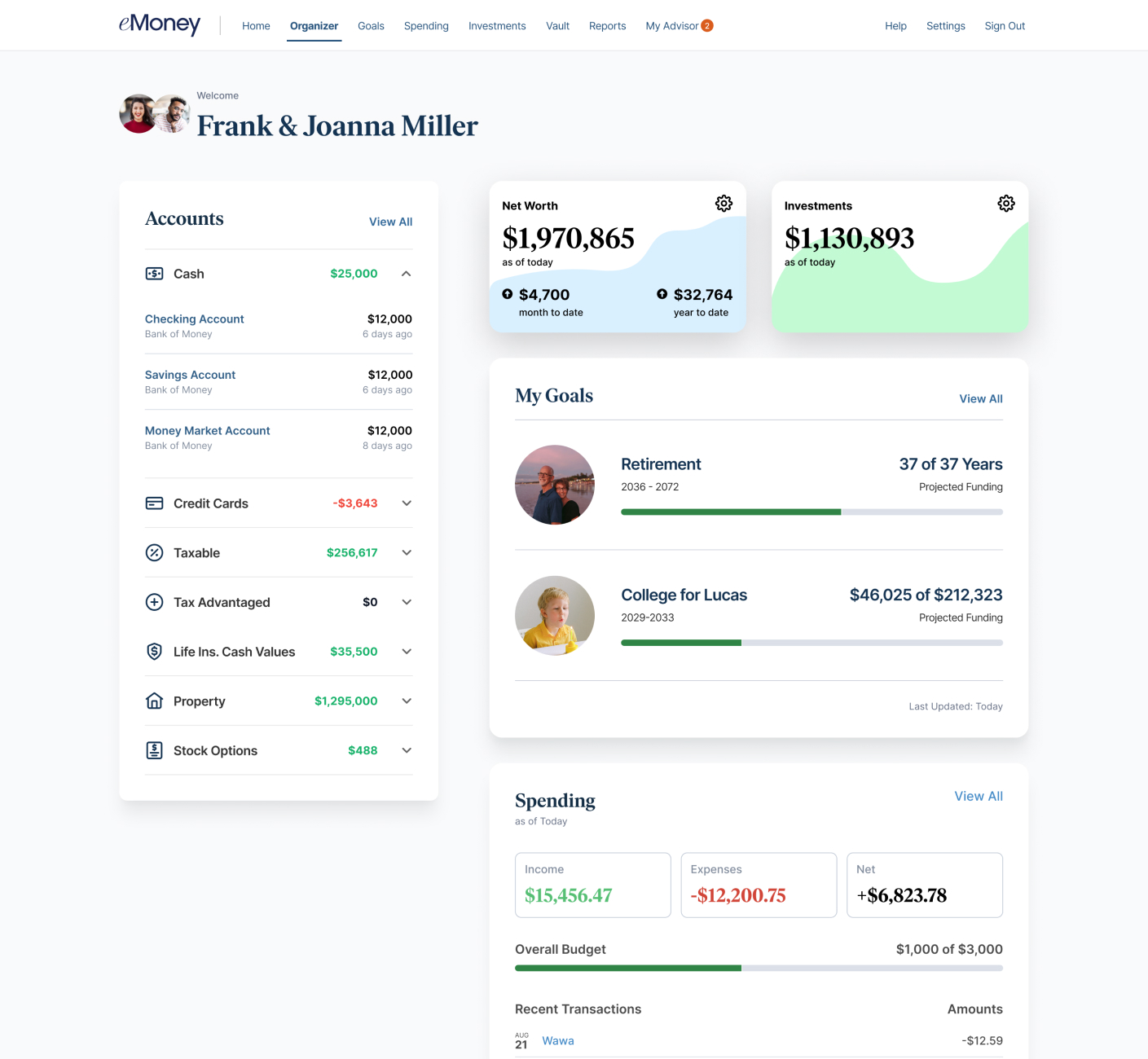
After research findings found that simple premium is the the more widely accepted path we defined that UI deeper through a design system update and applying that ui to the product client portal.
↓

↓


↓
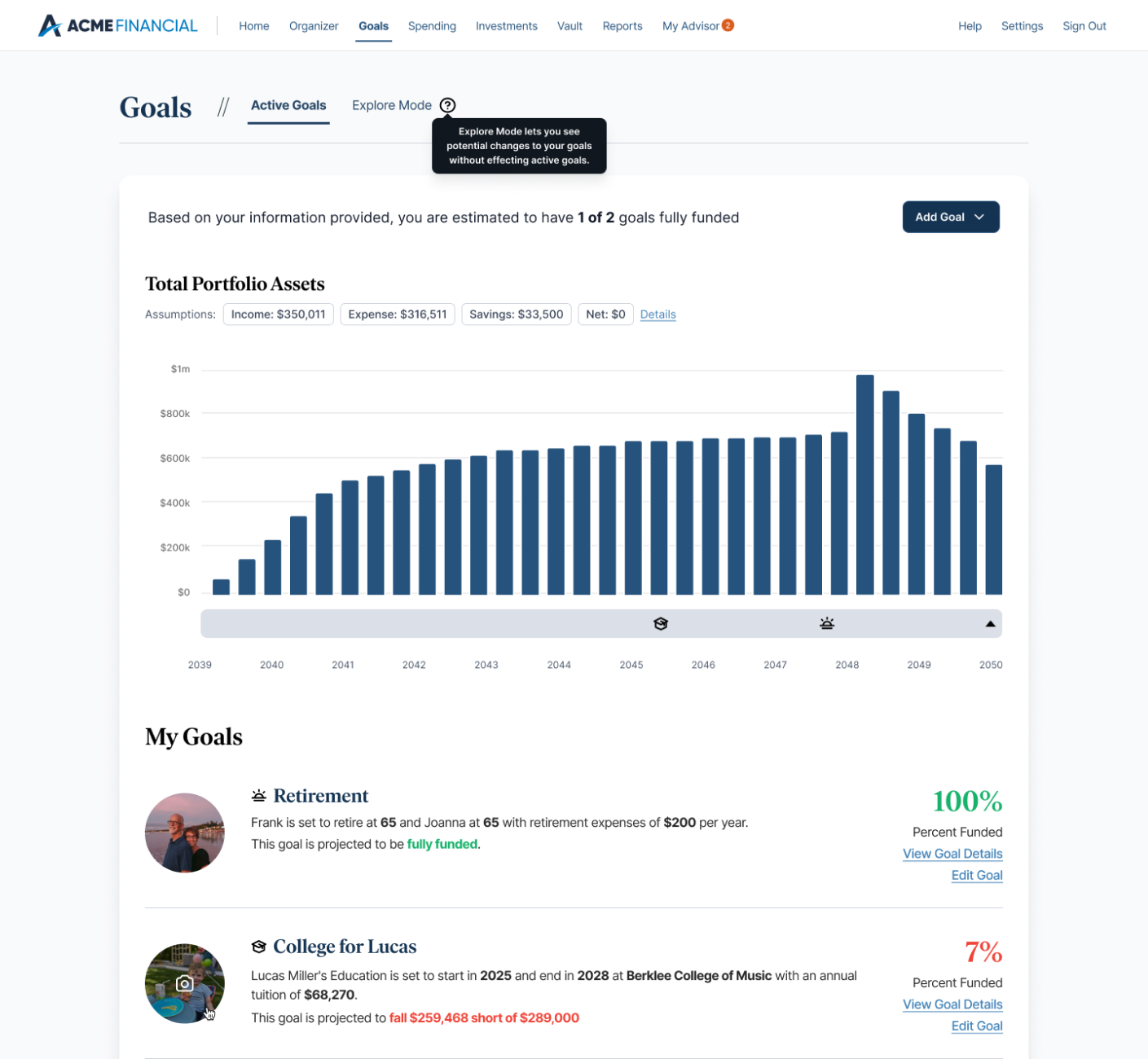
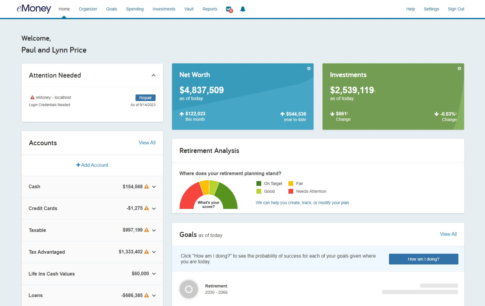
Top Row: Old Style, Bottom Row: New Simple Premium Applied
1 Leadership: Leading a large effort like this where it is a big effort and a big change for the company has taught me how to facilitate activities and keep everyone on target and engaged.
2 Management: When working with strong opinions it was a good learning exercise in handling emotions and mitigating controlling opinions.
3 Transparency: When working with something that will effect the company on a large scale being able to do some internal research to gather insight would help employees feel like they had a part to avoid design by committee.